Turning Trials into Paying Users:
Rethinking the Subscription Flow at Ninety
Problem & Goals
Problem
Trial users were dropping off before converting into paying customers. We saw that many teams didn’t understand they were in a trial, weren’t clear when it ended, or didn’t fully grasp what features would be lost without upgrading. Our goal was to improve the clarity of the trial experience and encourage teams to convert before hitting a wall.
Goals
Increase free trial to paid conversion
Improve awareness of trial expiration timing
Ensure decision-makers understood what action was needed and when
Improve the user journey from trial to paid subscription by simplifying the upgrade process

Discovery & Insights
To understand why conversion was low, I partnered with Product and Success to analyze both user behavior and qualitative feedback. We found:
Heatmaps showed low interaction with the banner showing trial status.
Customer interviews revealed many admins didn’t realize they were responsible for upgrading.
Support tickets indicated confusion about what would be lost after the trial.
These insights helped us reframe the problem: users weren’t choosing not to convert—they often didn’t know a decision point was approaching.
“Where do I go to subscribe?”
“Cant access after trial?? Bad process. We tried to transition from a trial to paid but cannot access our account, this is really high friction and very confidence eroding. Please advise on how we can get up and running asap or well have to use an alternative.”
“How many days are left in my trial?”
Strategy
Based on our findings, I designed a multi-touch strategy to:
Make the trial end date and feature loss more visible
Surface upgrade CTAs contextually, without disrupting the workflow
Clearly target team admins who had the authority to convert
We focused on low-effort, high-impact nudges across the trial period that felt supportive rather than salesy.
Design & Iteration

I explored several UX patterns and flows, including:
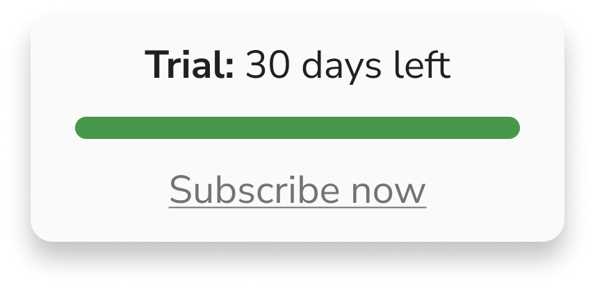
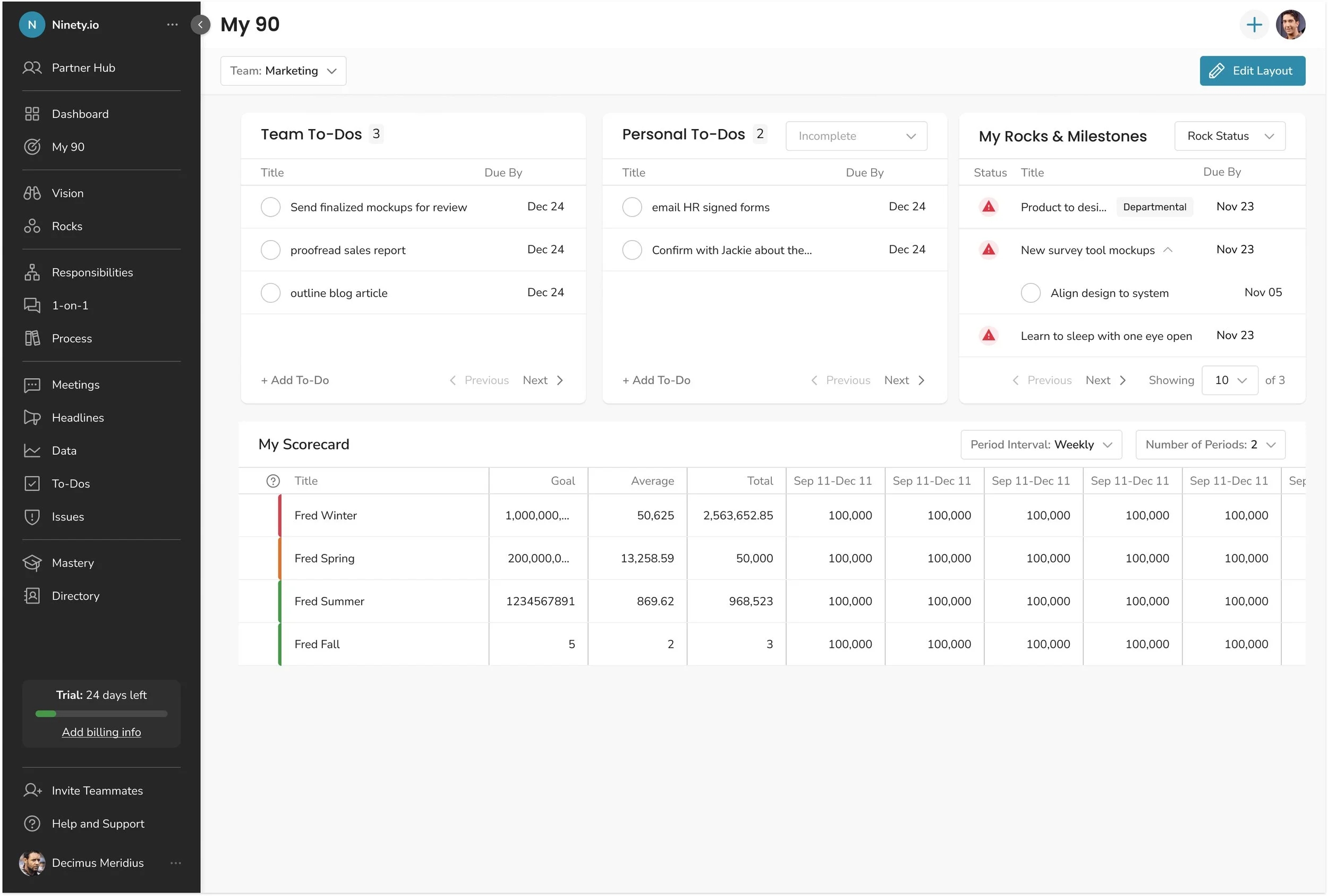
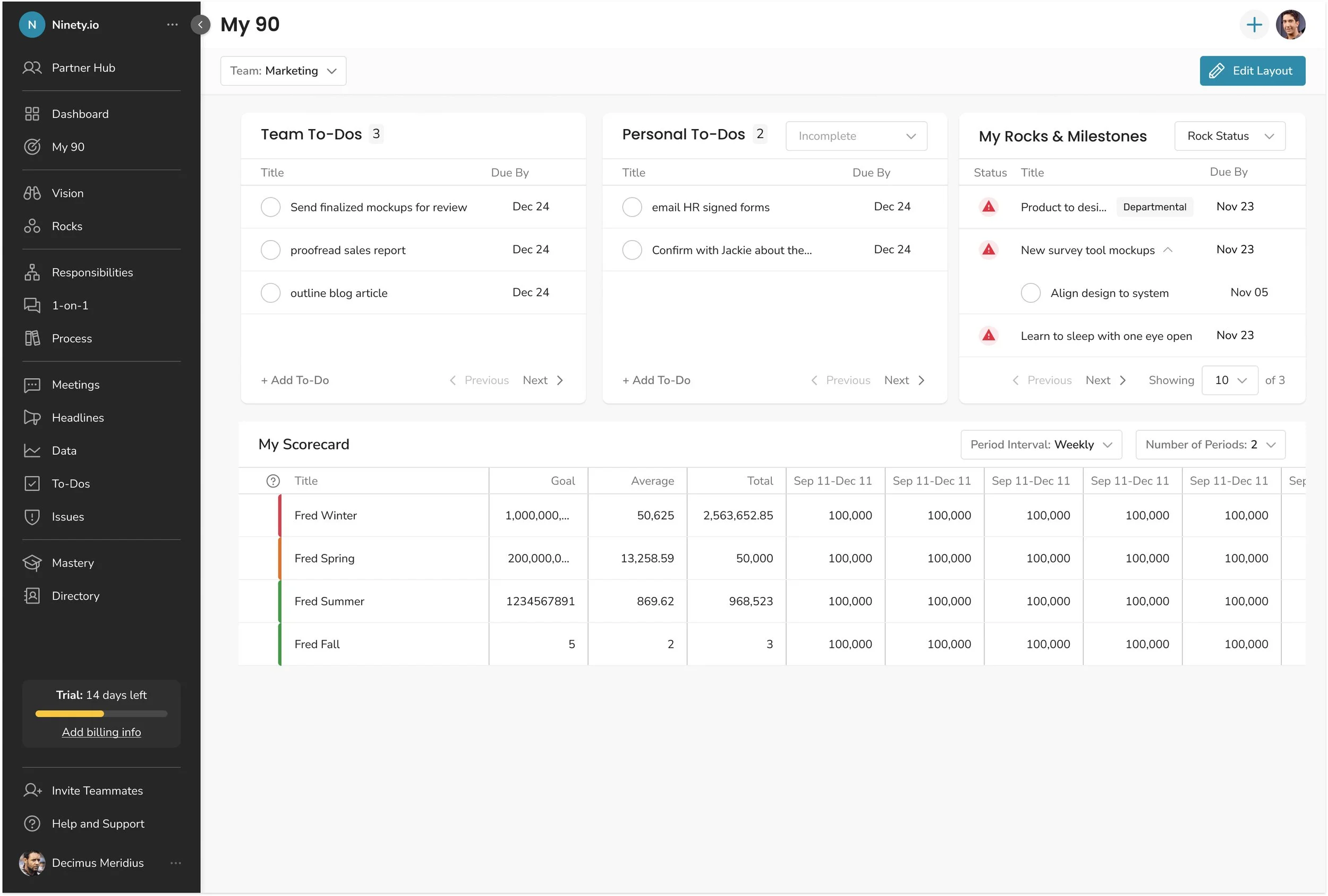
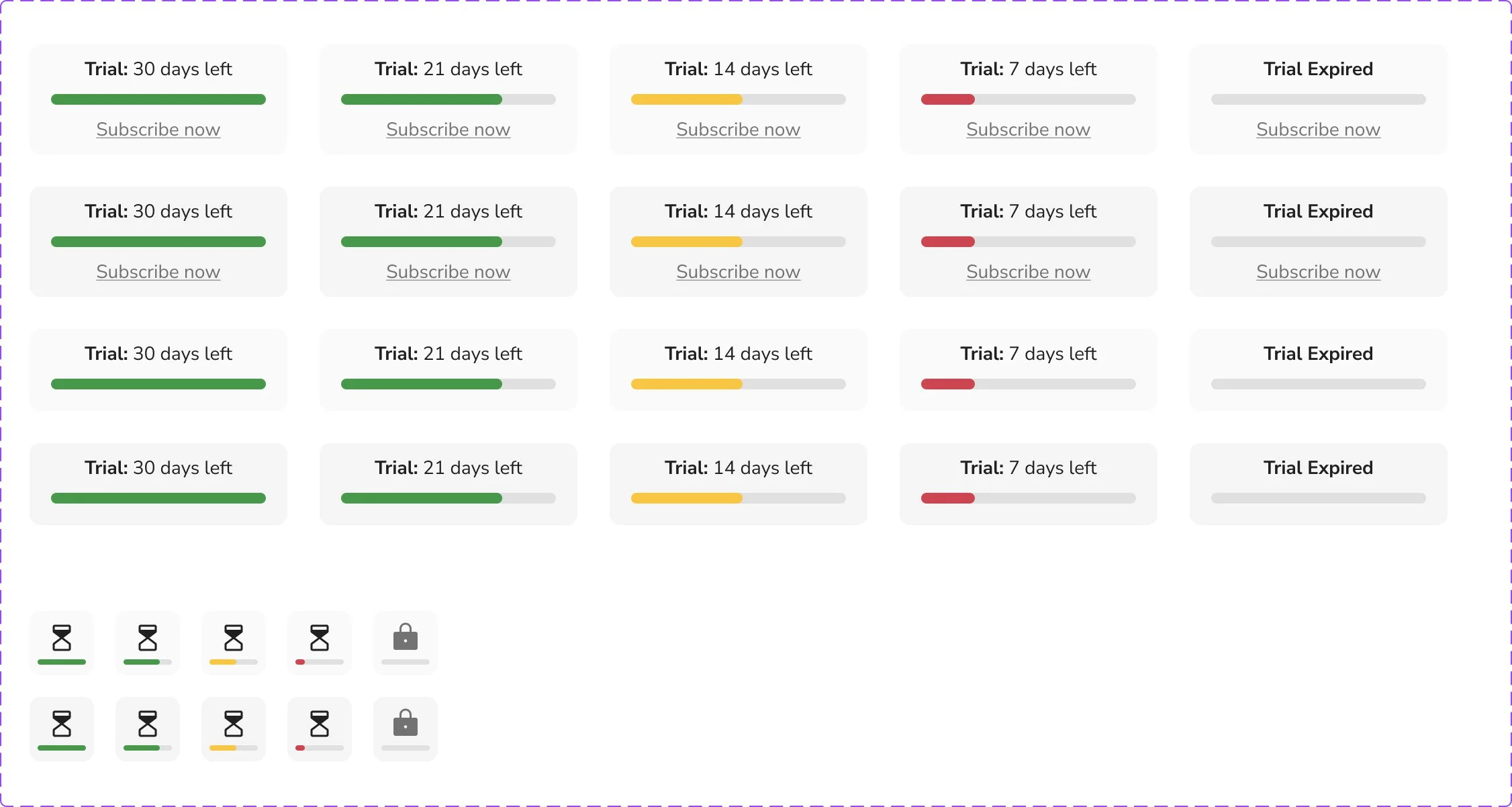
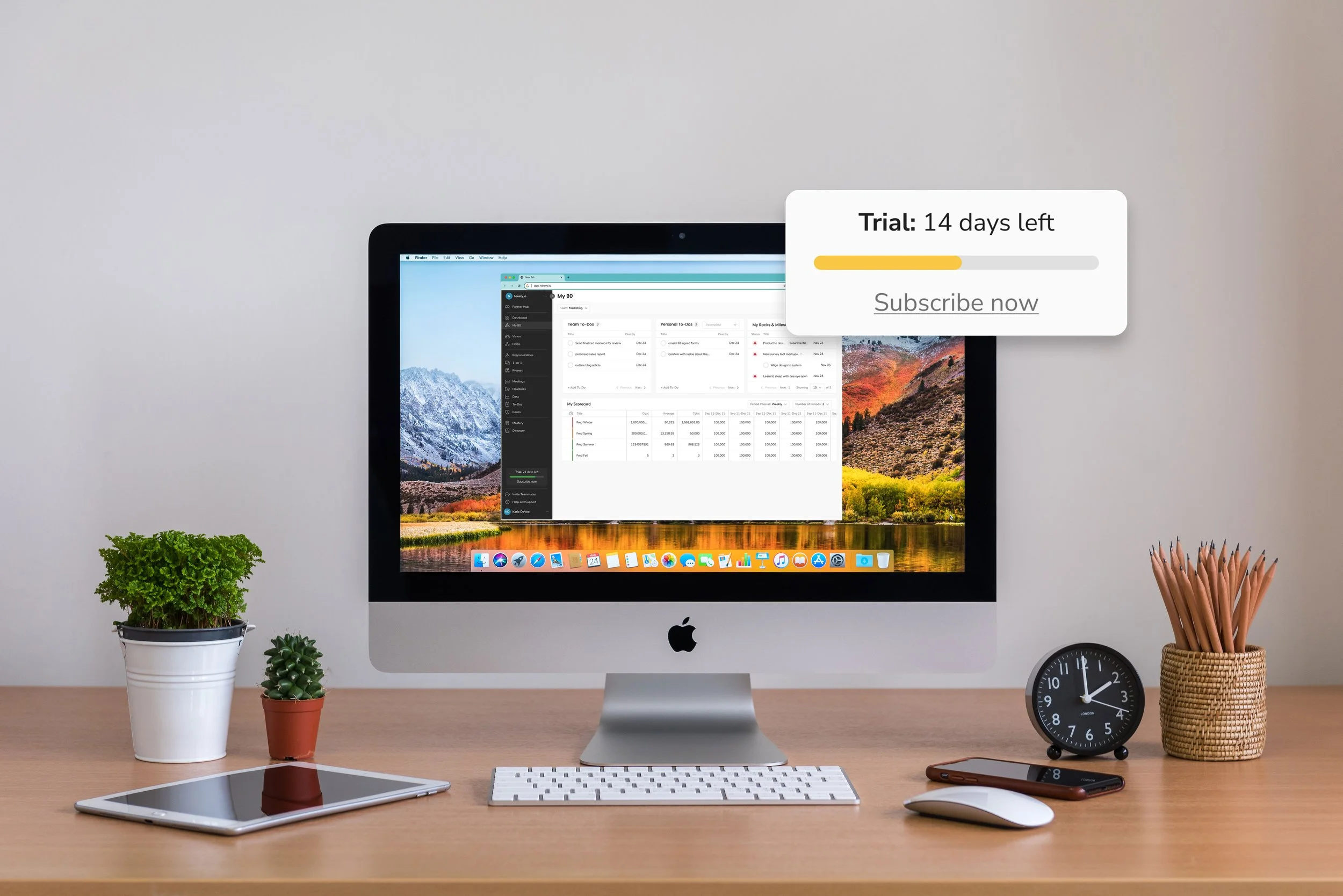
A persistent trial countdown banner
A “time is running out” modal targeting team admins
A lightweight upgrade prompt in the billing settings
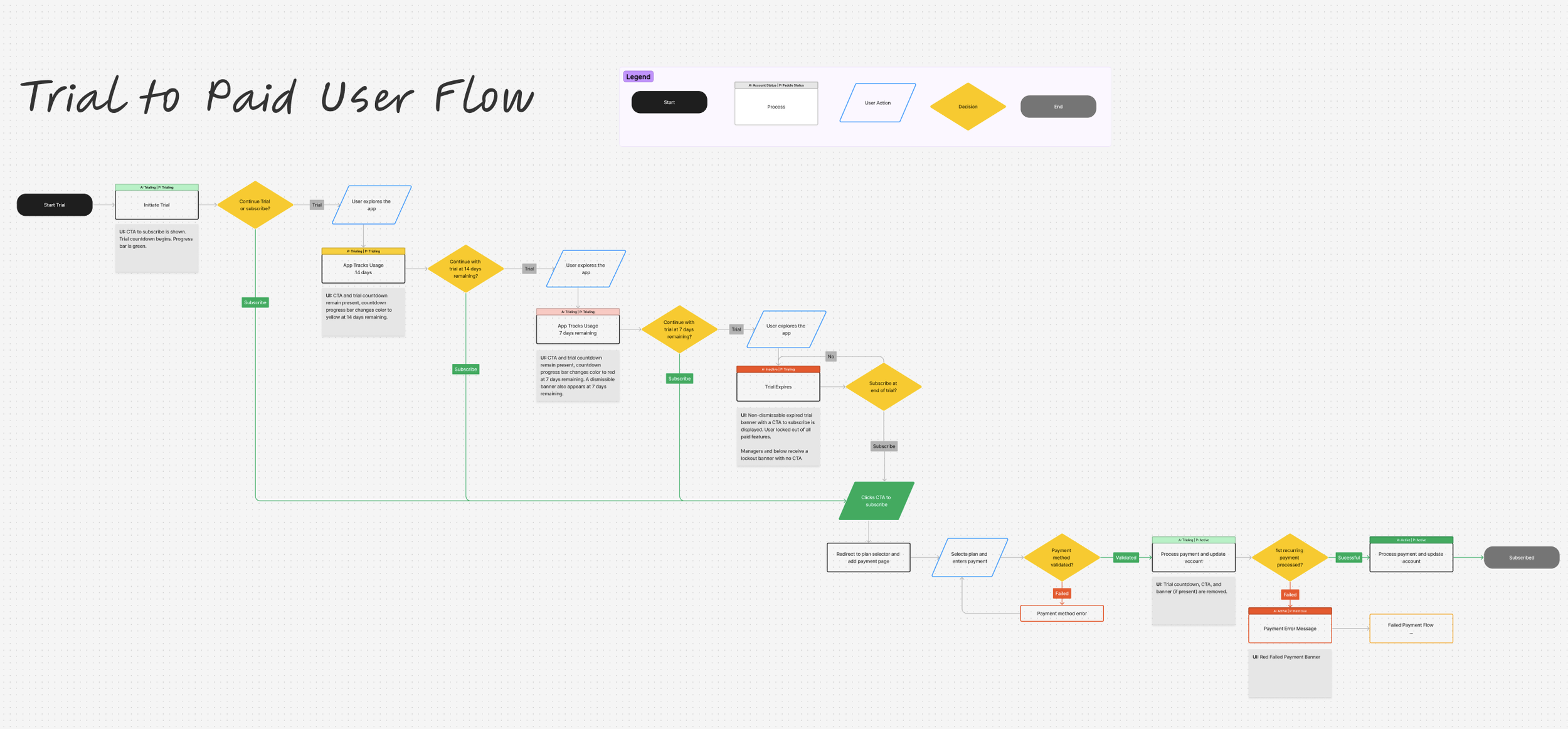
User Journey Mapping
Before jumping into UI design, I mapped the entire trial-to-paid experience to visualize key user actions, decision points, and system responses. This helped me identify where messaging was breaking down and where upgrade prompts could be most impactful.
Results
Through internal reviews and feedback from the Success team, usability testing and research, we honed in on a solution that felt timely, clear, and actionable.
Final designs included:
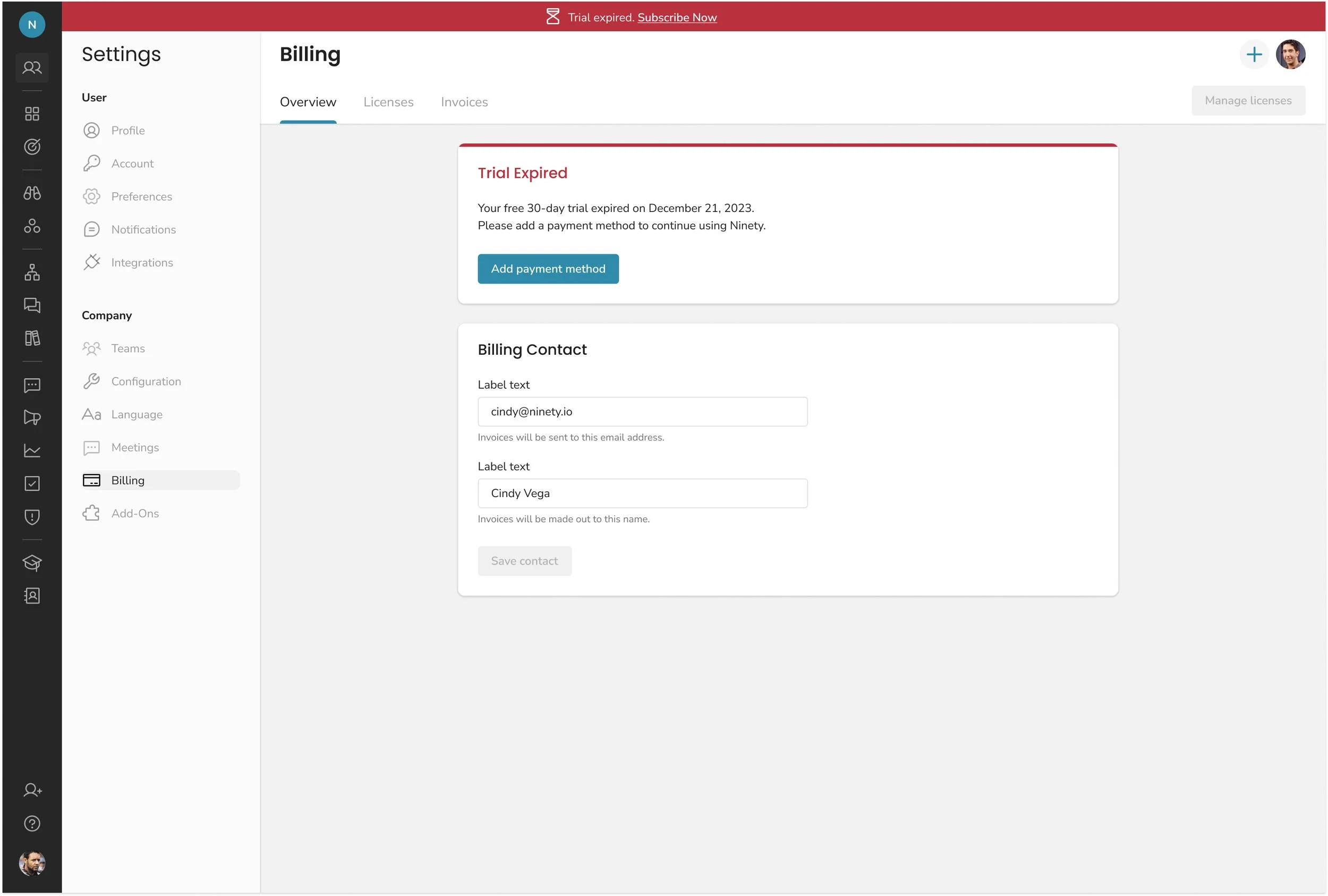
In-app banners showing time left, loss of access, and upgrade options
Admin-only modals as the trial neared expiration
Smart placement of upgrade CTAs in high-traffic tools
Each component was designed to feel native and helpful rather than intrusive.
Results:
Conversion rates increased in accounts exposed to the new flow
Support volume related to “trial expiration confusion” dropped significantly
Internal teams noted higher engagement with upgrade CTAs