Ninety.io Mobile App
Background
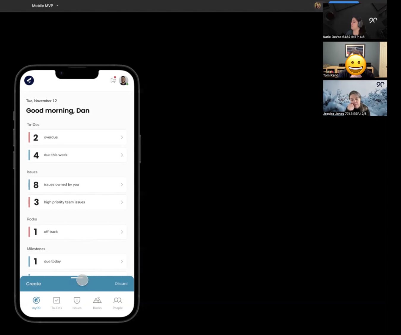
Ninety.io does not currently have a mobile app and it has been highly requested by customers. Our current mobile experience for our users has been noted as frustrating, confusing and not intuitive. Users are requesting that Ninety make a native mobile app for them for use on-the-go. We started with creating a mobile proof of concept.
My Role: Lead Product Designer
I spearheaded the initial discovery of the mobile app after compiling data that showed an urgent need for a native mobile app or pwa for Ninety. My goal was to provide a compelling argument to stakeholders that Ninety could benefit greatly from a mobile app offering to our clients. To do this, I showcased data alongside interviewing users of Ninety on why they want an app and to develop our mobile user persona.
My Responsibilities included:
Driving the vision, UX strategy, and design execution for Ninety’s first mobile app.
Collaborating with cross-functional partners in Product, Engineering, and Customer Success.
Designing a mobile-first design system from scratch for both iOS and Android.
Leading user research, wireframes, prototypes, visual design, and QA.
Team: Head of Product, Kyle Phillips; Product Managers, Andrea Leede, Fox Campbell; Engineers
“I would like to say that this tool is outstanding. However, the lack of notifications and the mobile app are annoying. The only notifications I have received using this software are the recaps of the L10 meetings. I want to receive notifications for issues and To-Do’s assigned to me, comments, headlines, new KPIs in the scoreboards, etc. Finally, without an app, this software is not versatile. In this era, we need to check things via laptop and mobile. The development of this app is imperative.”
The Opportunity
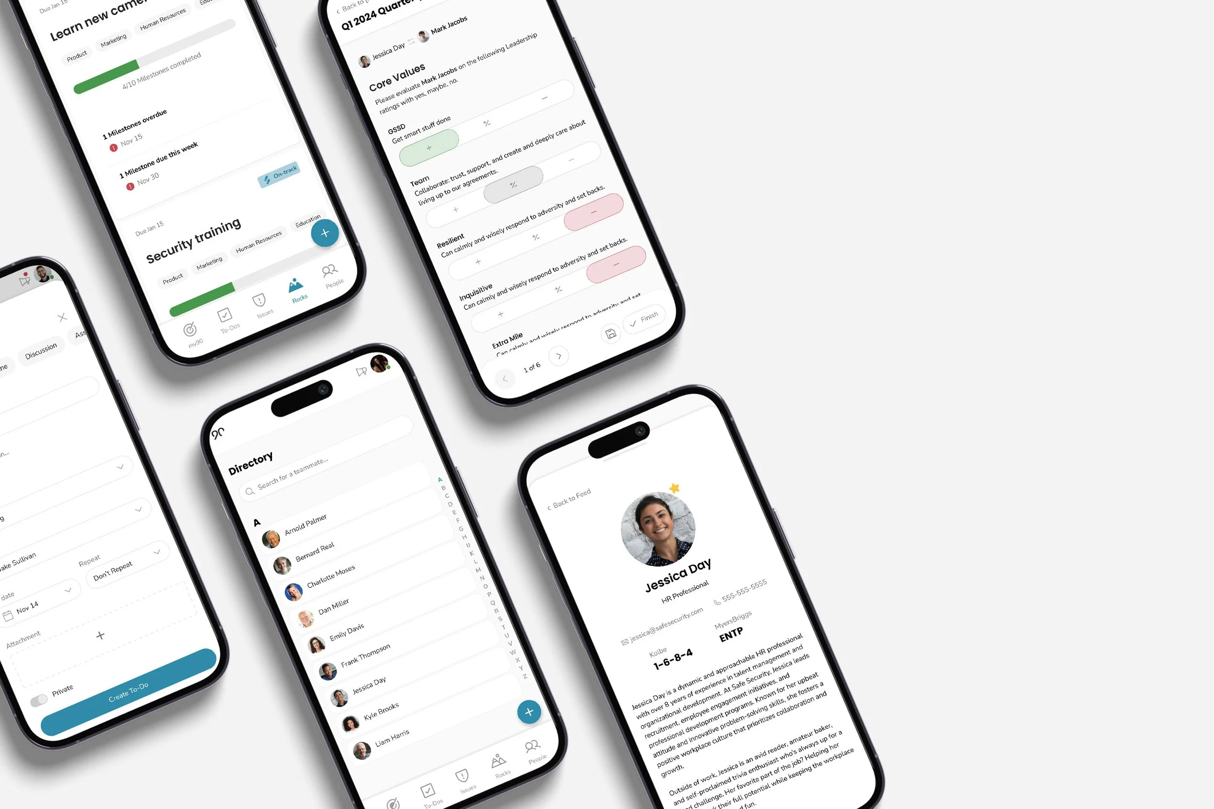
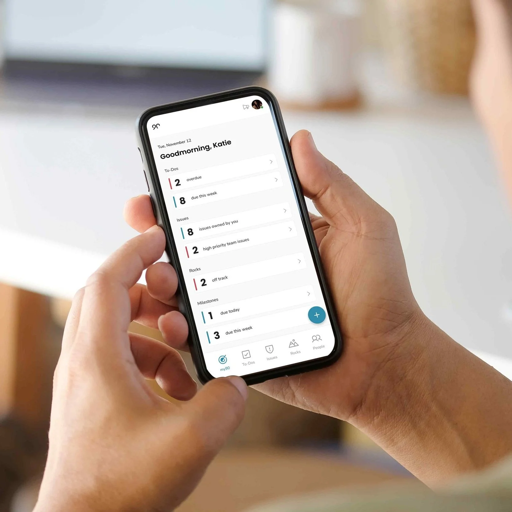
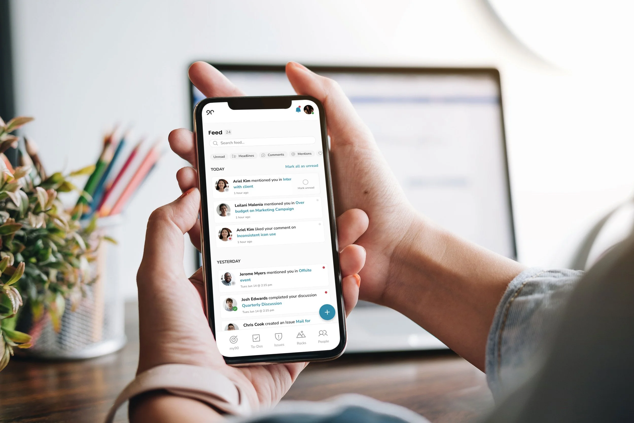
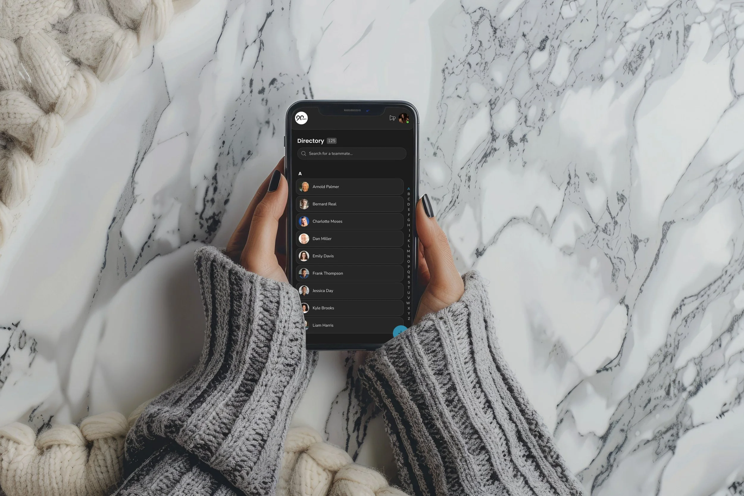
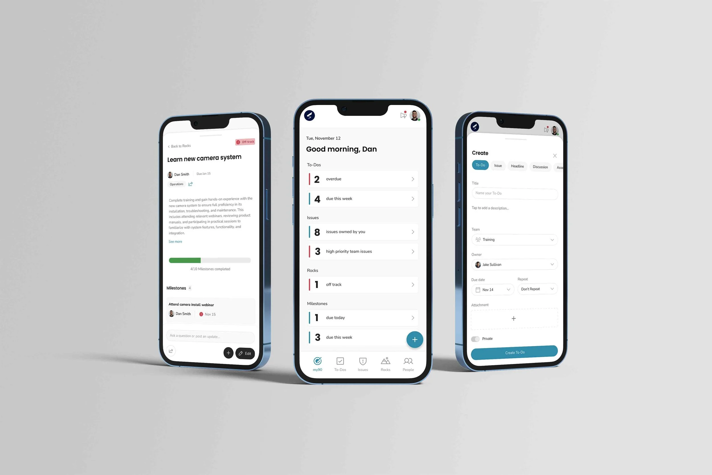
Ninety.io recognized the growing need for a seamless mobile experience as more users sought to manage their work on-the-go. While our desktop platform excels in providing robust business tools, many users need quick access to essential tasks—like creating a To-Do or logging an Issue—when away from their desks. To meet this demand, we set out to design a mobile app that keeps Ninety top-of-mind, enabling users to stay productive with an intuitive, action-driven experience tailored for on-the-go workflows.
The Problem
The challenge was to design an innovative mobile experience—not simply replicate the desktop. We wanted to give users something they would actually want to use, helping them stay organized and connected to their work and team.
When I joined the project, there was an early impulse to simply “translate” our desktop app to mobile. But my view—as shared by our Head of Product—was that this approach wouldn’t serve our users. The desktop app is complex and tool-based, designed for running meetings with a team in a room. Mobile users have different needs: they want to quickly check what’s assigned to them, capture ideas on the go, and see what needs urgent attention.
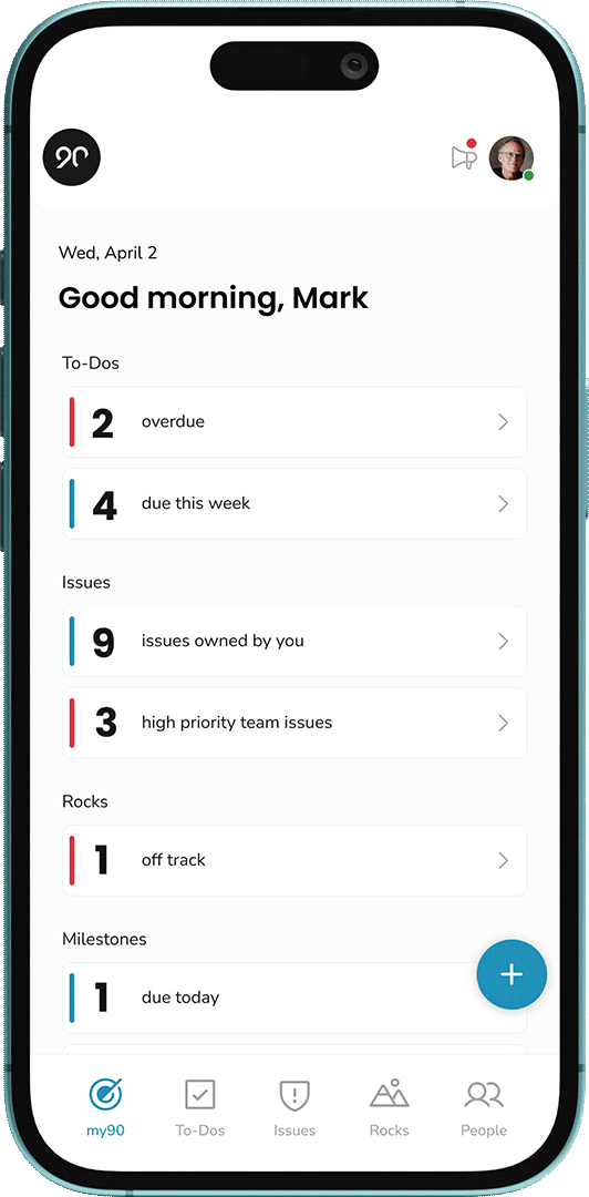
I advocated that we use this as an opportunity to design an experience users actually want, rather than re-creating our legacy UI. Working closely with the product team, we defined a vision for a ME-centered, action-focused mobile app:
Prioritize personal to-dos, issues, and rocks that are overdue or due soon
Guide the user on what to do next, not just show a database of everything
Make it easier than desktop to create and capture items on the go
This strategic shift—from “feature parity” to “user value”—was the foundation for all design decisions that followed.
Discovery
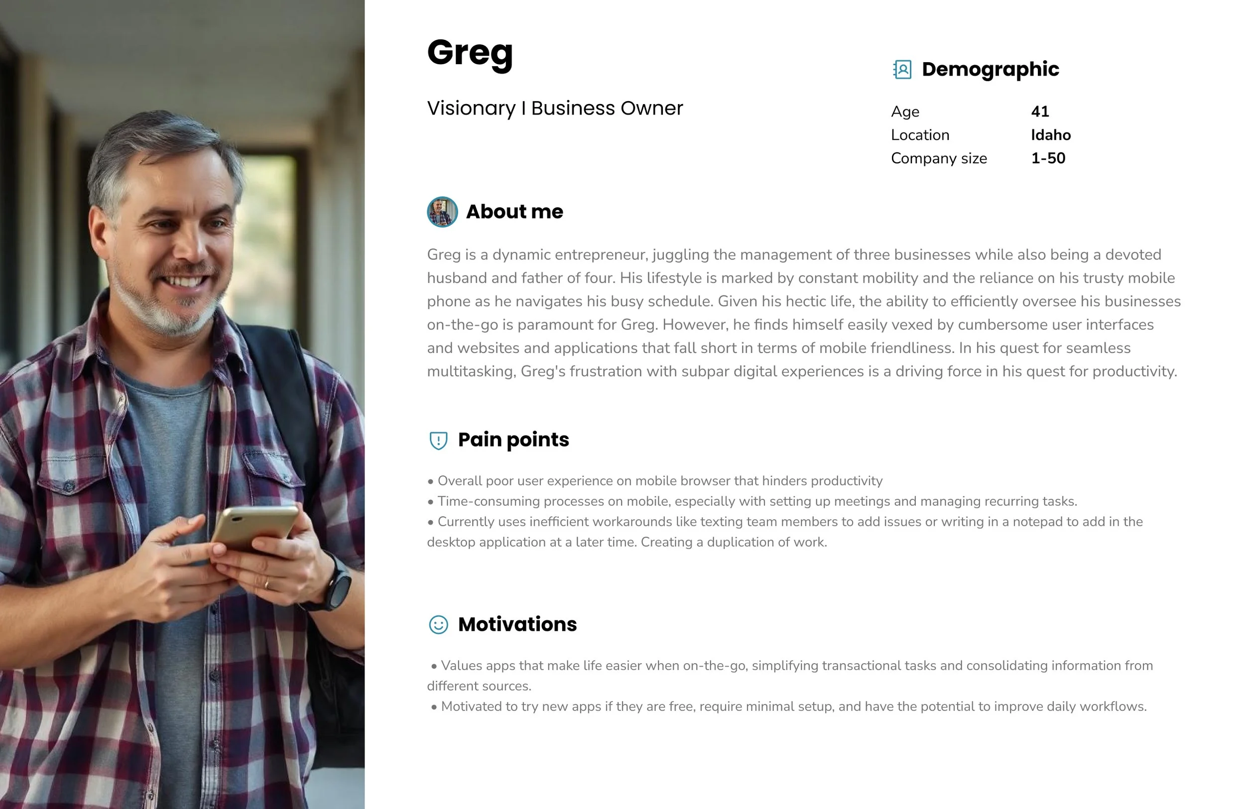
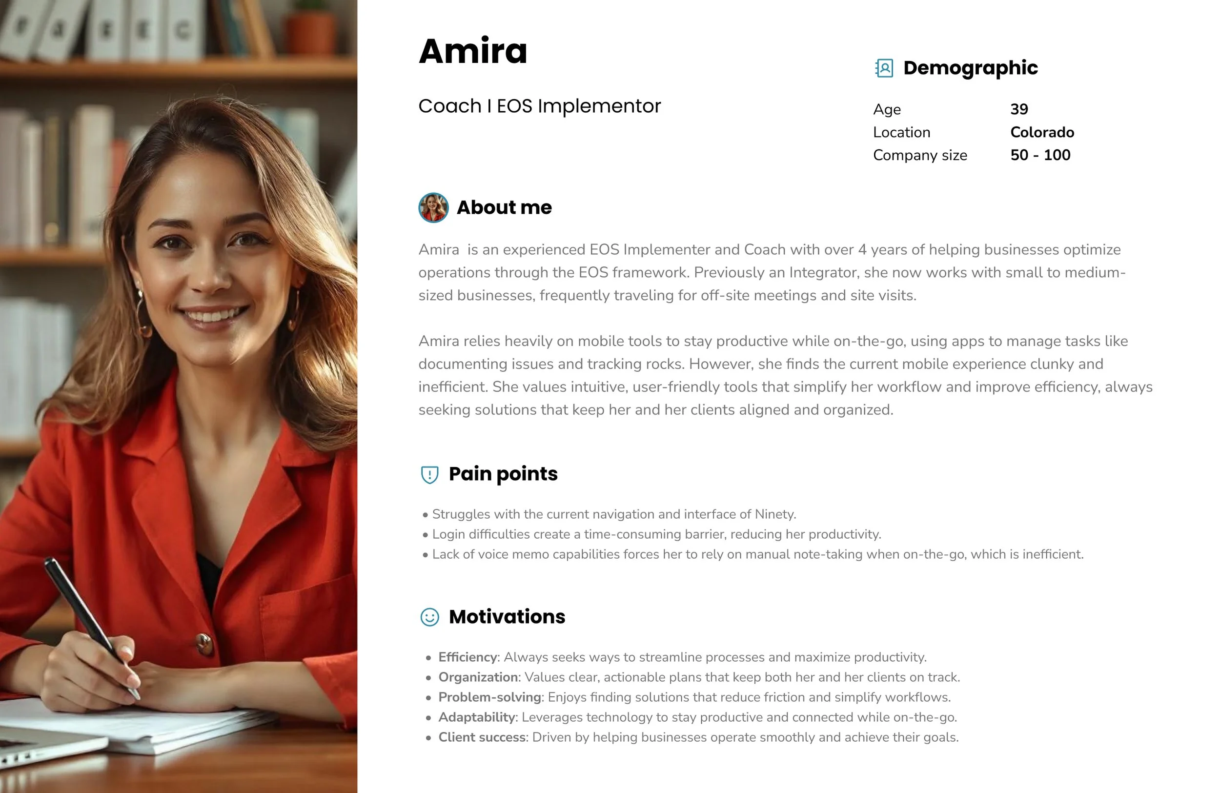
User Persona - User Interviews
I conducted user interviews of current customers who have requested a mobile app to help better understand our mobile user and create a user persona. In conducting these semi-structured user interviews, the goal was to gain a better understanding of the mobile user persona and their wants and needs. Designing a mobile app involves understanding not only the user's needs but also their preferences for the app's visual and interactive aspects.
I took the time to analyze the interviews in Dovetail and come up with some key themes and takeaways as I developed two main user personas for our platform.

Testing & Validation
Mapped out the user journey flows and designed unmoderated usability testing to identify main friction points.
Reviewed the information with stakeholders to choose an approach that would have the most impact based on available resources.
Tools
Figma, FigJam, Useberry, Gainsight, Dovetail, Jira, Slack
Ranked in Apple’s Top 100 Business Apps.
Available in the App Store and Google Play!
Mobile adoption reached 52% of active users within 90 days (3× higher than expected), with 40% of users returning monthly and 78% completing core tasks per session.
What I Learned
Designing mobile-first means prioritizing immediacy, not parity.
When launching something new, it’s crucial to think not just about what to build—but what not to build.
Building clarity into every layer of UX—from home screen hierarchy to task creation flow—makes a difference in adoption.